I will shortly be receiving a free copy of Django 1.0 Template Development in order to review it. In the meantime, the publishers have given me this article extracted from the book to publish on my site. Enjoy!
There are times when we will need to serve the same content in multiple ways whether it's displaying a printable version of a page, creating festive themes for holidays or promotions, or using a different set of templates for mobile devices.
There are a number of approaches to these tasks, and no one is "right". As we will see, the best choice depends on the circumstances specific to your site and users.
In this article by Scott Newman we will:
Consider the different approaches to tailoring output
Explore the challenges of serving content to mobile devices
Create printer-friendly output via URL parameters
Easily create site themes by overriding template files
Use a second domain name to serve mobile templates
Automatically redirect mobile users to an alternative URL
Considering the different approaches
Though there are different approaches that can be taken to serve content in multiple formats, the best solution will be specific to your circumstances and implementation.
Almost any approach you take will have maintenance overhead. You'll have multiple places to update when things change. As copies of your template files proliferate, a simple text change can become a large task.
Some of the cases we'll look at don't require much consideration. Serving a printable version of a page, for example, is straightforward and easily accomplished. Putting a pumpkin in your site header at Halloween or using a heart background around Valentine's Day can make your site seem timely and relevant, especially if you are in a seasonal business.
Other techniques, such as serving different templates to different browsers, devices, or user-agents might create serious debate among content authors. Since serving content to mobile devices is becoming a new standard of doing business, we'll make it the focus of this article.
Serving mobile devices
The Mobile Web will remind some old timers (like me!) of the early days of web design where we'd create different sites for Netscape and Internet Explorer. Hopefully, we take lessons from those days as we go forward and don't repeat our mistakes. Though we're not as apt to serve wholly different templates to different desktop browsers as we once were, the mobile device arena creates special challenges that require careful attention.
One way to serve both desktop and mobile devices is a one-size-fits-all approach. Through carefully structured and semantically correct XHTML markup and CSS selectors identified to be applied to handheld output, you can do a reasonable job of making your content fit a variety of contexts and devices.
However, this method has a couple of serious shortcomings. First, it does not take into account the limitations of devices for rich media presentation with Flash, JavaScript, DHTML, and AJAX as they are largely unsupported on all but the highest-end devices. If your site depends on any of these technologies, your users can get frustrated when trying to experience it on a mobile device.
Also, it doesn't address the varying levels of CSS support by different mobile devices. What looks perfect on one device might look passable on another and completely unusable on a third because only some of the CSS rules were applied properly. It also does not take into account the potentially high bandwidth costs for large markup files and CSS for users who pay by the amount of data transferred. For example, putting display: none on an image doesn't stop a mobile device from downloading the file. It only prevents it from being shown.
Finally, this approach doesn't tailor the experience to the user's circumstances. Users tend to be goal-oriented and have specific actions in mind when using the mobile web, and content designers should recognize that simply recreating the desktop experience on a smaller screen might not solve their needs. Limiting the information to what a mobile user is looking for and designing a simplified navigation can provide a better user experience.
Adapting content
You know your users best, and it is up to you to decide the best way to serve them. You may decide to pass on the one-size-fits-all approach and serve a separate mobile experience through content adaptation.
The W3C's Mobile Web Initiative best practices guidelines suggest giving users the flexibility and freedom to choose their experience, and provide links between the desktop and mobile templates so that they can navigate between the two. It is generally not recommended to automatically redirect users on mobile devices to a mobile site unless you give them a way to access the full site.
The dark side to this kind of content adaptation is that you will have a second set of template files to keep updated when you make site changes. It can also cause your visitors to search through different bookmarks to find the content they have saved.
Before we get into multiple sites, let's start with some examples of showing alternative templates on our current site.
Setting up our example
Since we want to customize the output of our detail page based on the presence of a variable in the URL, we're going to use a view function instead of a generic view.
Let us consider a press release application for a company website. The press release object will have a title, body, published date, and author name.In the root directory of your project (in the directory projects/mycompany), create the press application by using the startapp command:
$ python manage.py startapp press
This will create a press folder in your site. Edit the mycompany/press/models.py file:
from django.db import models

class PressRelease(models.Model):
    title = models.CharField(max_length=100)
    body = models.TextField()
    pub_date = models.DateTimeField()
    author = models.CharField(max_length=100)

    def __unicode__(self):
        return self.title
Create a file called admin.py in the mycompany/press directory, adding these lines:
from django.contrib import admin
from mycompany.press.models import PressRelease
admin.site.register(PressRelease)
Add the press and admin applications to your INSTALLED_APPS variable in the settings.py file:
INSTALLED_APPS = (
    'django.contrib.auth',
    'django.contrib.admin',
    'django.contrib.contenttypes',
    'django.contrib.sessions',
    'django.contrib.sites',
    'mycompany.press',
)
In the root directory of your project, run the syncdb command to add the new models to the database:
$ python manage.py syncdb
We will be prompted to create a superuser, go ahead and create it. We can access the admin site by browsing to http://localhost:8000/admin/ and add data.
Create your mycompany/press/urls.py file as shown:
urlpatterns = patterns('',
   (r'detail/(?P<pid>d+)/$', 'mycompany.press.views.detail'),
   (r'list/$','django.views.generic.list_detail.object_list', press_list_dict),
   (r'latest/$','mycompany.press.views.latest'),
   (r'$','django.views.generic.simple.redirect_to', {'url': '/press/list/'}))
In your mycompany/press/views.py file, your detail view should look like this:
from django.http import HttpResponse
from django.shortcuts import get_object_or_404
from django.template import loader, Context
from mycompany.press.models import PressRelease

def detail(request, pid):
    ''' Accepts a press release ID and returns the detail page '''
    p = get_object_or_404(PressRelease, id=pid)
    t = loader.get_template('press/detail.html')
    c = Context({'press': p})
    return HttpResponse(t.render(c))
Let's jazz up our template a little more for the press release detail by adding some CSS to it. In mycompany/templates/press/detail.html, edit the file to look like this:
<html>
<head>
  <title>{{ press.title }}</title>
  <style type="text/css">
   body {
     text-align: center;
   }
   #container {
     margin: 0 auto;
     width: 70%;
     text-align: left;
   }
   .header {
     background-color: #000;
     color: #fff;
   }
  </style>
</head>
<body>
<div id="container">
  <div class="header">
    <h1>MyCompany Press Releases</h1>
  </div>
  <div>
    <h2>{{ press.title }}</h2>
    <p>
      Author: {{ press.author }}<br/>
      Date: {{ press.pub_date }}<br/>
    </p>
    <p>
     {{ press.body }}
    </p>
  </div>
</div>
</body>
</html>
Start your development server and point your browser to the URL http://localhost:8000/press/detail/1/. You should see something like this, depending on what data you entered before when you created your press release:
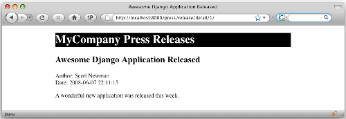
If your press release detail page is serving correctly, you're ready to continue.
Remember that generic views can save us development time, but sometimes you'll need to use a regular view because you're doing something in a way that requires a view function customized to the task at hand. The exercise we're about to do is one of those circumstances, and after going through the exercise, you'll have a better idea of when to use one type of view over another.
Serving printable pages
One of the easiest approaches we will look at is serving an alternative version of a page based on the presence of a variable in the URL (aka a URL parameter). To serve a printable version of an article, for example, we can add ?printable to the end of the URL.
To make it work, we'll add an extra step in our view to check the URL for this variable. If it exists, we'll load up a printer-friendly template file. If it doesn't exist, we'll load the normal template file.
Start by adding the highlighted lines to the detail function in the mycompany/press/views.py file:
def detail(request, pid):
    '''
    Accepts a press release ID and returns the detail page
    '''
    p = get_object_or_404(PressRelease, id=pid)

    if request.GET.has_key('printable'):
        template_file = 'press/detail_printable.html'
    else:
        template_file = 'press/detail.html'

    t = loader.get_template(template_file)
    c = Context({'press': p})
    return HttpResponse(t.render(c))
We're looking at the request.GET object to see if a query string parameter of printable was present in the current request. If it was, we load the press/detail_printable.html file. If not, we load the press/detail.html file. We've also changed the loader.get_template function to look for the template_file variable.
To test our changes, we'll need to create a simple version of our template that only has minimal formatting. Create a new file called detail_printable.html in the mycompany/templates/press/ directory and add these lines into it:
<html>
<head>
<title>{{ press.title }}</title>
</head>
<body>
<h1>{{ press.title }}</h1>
<p>
Author: {{ press.author }}<br/>
Date: {{ press.pub_date }}<br/>
</p>
<p>
{{ press.body }}
</p>
</body>
</html>
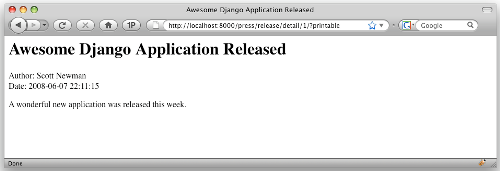
Now that we have both regular and printable templates, let's test our view. Point your browser to the URL http://localhost:8000/press/detail/1/, and you should see our original template as it was before. Change the URL to http://localhost:8000/press/detail/1/?printable and you should see our new printable template:
Creating site themes
Depending on the audience and focus of your site, you may want to temporarily change the look of your site for a season or holiday such as Halloween or Valentine's Day. This is easily accomplished by leveraging the power of the TEMPLATE_DIRS configuration setting.
The TEMPLATE_DIRS variable in the settings.py file allows you to specify the location of the templates for your site. Also TEMPLATE_DIRS allows you to specify multiple locations for your template files.
When you specify multiple paths for your template files, Django will look for a requested template file in the first path, and if it doesn't find it, it will keep searching through the remaining paths until the file is located.
We can use this to our advantage by adding an override directory as the first element of the TEMPLATE_DIRS value. When we want to override a template with a special themed one, we'll add the file to the override directory. The next time the template loader tries to load the template, it will find it in the override directory and serve it.
For example, let's say we want to override our press release page from the previous example. Recall that the view loaded the template like this (from mycompany/press/views.py):
When the template engine loads the press/detail.html template file, it gets itfrom the mycompany/templates/ directory as specified in the mycompany/settings.py file:
If we add an additional directory to our TEMPLATE_DIRS setting, Django will look in the new directory first:
Now when the template is loaded, it will first check for the file /projects/mycompany/templates/override/press/detail.html. If that file doesn't exist, it will go on to the next directory and look for the file in /projects/mycompany/templates/press/detail.html.
If you're using Windows, use the Windows-style file path c:/projects/mycompany/templates/ for these examples.
Therein lies the beauty. If we want to override our press release template, we simply drop an alternative version with the same file name into the override directory. When we're done using it, we just remove it from the override directory and the original version will be served (or rename the file in the override directory to something other than detail.html).
If you're concerned about the performance overhead of having a nearly empty override directory that is constantly checked for the existence of template files, we should consider caching techniques as a potential solution for this.
Testing the template overrides
Let's create a template override to test the concept we just learned. In your mycompany/settings.py file, edit the TEMPLATE_DIRS setting to look like this:
Create a directory called override at mycompany/templates/ and another directory underneath that called press. You should now have these directories:
/projects/mycompany/templates/override/
/projects/mycompany/templates/override/press/
Create a new file called detail.html in mycompany/templates/override/press/ and add these lines to the file:
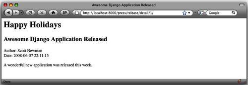
<html>
<head>
<title>{{ press.title }}</title>
</head>
<body>
<h1>Happy Holidays</h1>
<h2>{{ press.title }}</h2>
<p>
Author: {{ press.author }}<br/>
Date: {{ press.pub_date }}<br/>
</p>
<p>
{{ press.body }}
</p>
</body>
</html>
You'll probably notice that this is just our printable detail template with an extra "Happy Holidays" line added to the top of it.
Point your browser to the URL http://localhost:8000/press/detail/1/ and you should see something like this:
By creating a new press release detail template and dropping it in the override directory, we caused Django to automatically pick up the new template and serve it without us having to change the view. To change it back, you can simply remove the file from the override directory (or rename it).
One other thing to notice is that if you add ?printable to the end of the URL, it still serves the printable version of the file we created earlier.
Delete the mycompany/templates/override/ directory and any files in it as we won't need them again.
 Django 1.0 Template Development
A practical guide to Django template development with custom tags, filters, multiple templates, caching, and more
Dive into Django's template system and build your own template
Learn to use built-in tags and filters in Django 1.0
Practical tips for project setup and template structure
Use template techniques to improve your application's performance
Serving different templates by domain name
An increasingly common need for web applications is to serve a set of alternative templates for mobile devices. A common way to serve this alternative view of your site is to use a different domain name, such as mobile.mydomain.com, m.mydomain.com or mydomain.mobi.
Django makes it very easy to serve a secondary domain name from the same base project. When you configure your web server to serve your Django site, you tell it what settings file to use, so you can create a second settings file in the same directory and give it a different value for the TEMPLATE_DIRS setting.
For example, your main site would point to mycompany/settings.py and have a TEMPLATE_DIRS setting like this:
Your mobile site would point to mycompany/settings_mobile.py with a TEMPLATE_DIRS setting like this:
This technique gets even better when you realize that you don't have to completely duplicate your settings.py file when creating settings_mobile.py. Because the only thing we need to change between the two files is the TEMPLATE_DIRS value, the only lines you need to put in your settings_mobile.py file are these:
The first line imports all the existing values from the mycompany/settings.py file. The second line overrides the value of TEMPLATE_DIRS with our new directory. This technique has the added benefit that changes to the settings.py file don't have to be duplicated into settings_mobile.py. They will be automatically picked up.
Serving different sites with the development web server
We can test how this works by using the development web server that we've been using all along and specifying which settings file to use. (You can also make your production web server, such as Apache or lighttpd do this. You'll find configuration information in Django's online documentation.) We'll start two instances of the development server on different ports to simulate the real-world example of using two different domains.
Step 1: Cloning the settings File
Create a new file in your mycompany directory called settings_mobile.py. In that file, insert these lines:
Because this file exists in the same directory as settings.py, it's able to use a simple import statement to bring in all its values.
Step 2: Create a mobile template
We won't go into the details of creating templates that are friendly to mobile web browsers, as there is plenty of information available online on this. (If you're interested, dev.mobi is an excellent resource for information on that subject as well as Mobile Web Development by Nirav Mehta, printed by Packt Publishing.)
To test our setup, we'll create a different template so that we can see that it served properly. Create a new directory in mycompany/templates/ called mobile. Create a press directory in the mycompany/templates/mobile/ directory.
You should now have these directories:
mycompany/templates/press/
mycompany/templates/mobile/press/
Create a new file called detail.html in your mycompany/templates/mobile/press/ directory and add these lines:
<html>
  <head>
    <title>{{ press.title }}</title>
  </head>
  <body>
    <h1>MyCompany Mobile</h1>
    <h2>{{ press.title }}</h2>
    <p>
     Author: {{ press.author }}<br/>
     Date: {{ press.pub_date }}<br/>
   </p>
   <p>
    {{ press.body }}
   </p>
  </body>
</html>
Step 3: Configuring the development web server
When using the development web server, it's possible to tell it what settings file to run against by passing a command-line argument:
$ manage.py runserver --settings=settings_mobile
Using two separate terminal windows, run two different instances of the web server at two different ports so that we can test the differences:
$ manage.py runserver 8000 --settings=settings
$ manage.py runserver 8001 --settings=settings_mobile
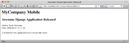
If we point our web browser at the URL http://localhost:8000/press/detail/1/, we'll get the regular version of our press release. If we use the URL http://localhost:8001/press/detail/1/, we'll get the new mobile version of the site like this:
(I was introduced to this method by Matt Croydon's blog at postneo.com. He agreed to let me share it. Thanks, Matt!)
Redirecting users to the mobile site
I saved this section for last because it's entirely optional and uses some advanced concepts. You can consider it as an extra credit exercise.
Now that we have a second site set up for mobile users, we may want to automatically redirect our users to it if we can tell they are using a mobile device.
This technique isn't foolproof and could cause difficulties for some of your users who want to be able to choose their mobile experience. We'll code a way with which they can get back to the main site, but consider this when deciding if you want to use the technique.
Detecting mobile devices
The HTTP_USER_AGENT is the key piece of information we will use to determine how the user is accessing the site. It's a string containing the identity of the browser being used; consider it the "fingerprint" of the browser. In Django, the user agent string is available from the key request.META['HTTP_USER_AGENT'].
Here's the user agent from iPhone (There is no line break, it's one long, continued line.):
Mozilla/5.0 (iPhone; U; CPU like Mac OS X; en) AppleWebKit/420+ (KHTML, like Gecko) Version/3.0 Mobile/1A543a Safari/419.3
Notice that the string is full of version numbers. If you try to match on these strings directly, you could end up with hundreds or thousands of strings to check against, as new versions are released on different platforms. Inside the string, however, are two strings that we might use to give us a clue whether this is a mobile device, Mobile and iPhone.
Instead of seeing if the current user agent is equal to this string, we'll use regular expressions to look inside the string for patterns we know match common mobile user agents.
Here's a Python snippet from the interactive shell to illustrate the point:
>>> import re
>>> user_agent = '''Mozilla/5.0 (iPhone; U; CPU like Mac OS X; en)AppleWebKit/420+ (KHTML, like Gecko) Version/3.0 Mobile/1A543a Safari/419.3'''
>>> re.search('iPhone', user_agent)
<_sre.SRE_Match object at 0x736b0>
When we searched for the term iPhone inside of the user_agent string, we found a match. We can use this kind of test to determine if the request is coming from a mobile device. We could check this in each of our views, but that would require a lot of redundant code. Instead, we'll write it into a piece of Django middleware that will run before each request is processed.
Regular expressions can be tricky to work with, and you may want to read up on how they work before diving in. They can be incredibly powerful, so it's probably time well spent!
Writing the middleware
Middleware functions allow you to "tap in" or inject functions into the request and response cycle. We'll use a process request middleware function to check for a mobile device before any views are executed.
The first thing we'll need to do is create a directory under our
project in which to put our middleware file. Create a new directory
under the existing mycompany directory called middleware. Inside
the new directory, we'll create two files:
mycompany/middleware/__init__.py and
mycompany/middleware/mobile_redirect.py
The first file, __init__.py, is just a blank file that Python
needs for its importing process. Don't worry too much about it;
just create it as a blank file. The second file,
mobile_redirect.py, will contain the logic to do our redirection.
Here's the first pass at our code. Enter these lines in mobile_redirect.py:
from django.http import HttpResponseRedirect
import re

mobile_url = 'http://localhost:8001/'

agents_list = [
    'Nokia','bMOT','^LGE?b','SonyEricsson',
    'Ericsson','BlackBerry','DoCoMo','Symbian',
    'Windows CE','NetFront','Klondike','PalmOS',
    'PalmSource','portalmm','S[CG]H-','bSAGEM',
    'SEC-','jBrowser-WAP','Mitsu','Panasonic-',
    'SAMSUNG-','Samsung-','Sendo','SHARP-',
    'Vodaphone','BenQ','iPAQ','AvantGo',
    'Go.Web','Sanyo-','AUDIOVOX','PG-',
    'CDM[-d]','^KDDI-','^SIE-','TSM[-d]',
    '^KWC-','WAP','^KGT [NC]','iPhone',
]


def is_mobile(user_agent):
    for agent in agents_list:
        if re.search(agent, user_agent):
            return True
    return False


class MobileRedirect(object):
    def process_request(self, request):
        if is_mobile(request.META['HTTP_USER_AGENT']):
            return HttpResponseRedirect(mobile_url)
        else:
            pass
        return None
Starting at the bottom, we've created a generic object called MobileRedirect that has a process_request method. (Django's middleware system requires us to set it up this way.)
We're calling a function is_mobile_device that takes the user agent as an argument, determines if it matches against a list of known mobile agents, and returns a Boolean True or False. If it matched, we redirect the user to our mobile site. If not, the middleware will return None and Django will continue.
The is_mobile_device function iterates through a list of regular expression patterns and looks for a match. Notice that the user_agents list contains regular expression patterns just like the one we worked with a minute ago. You'll see some regular expression syntax such as b and d that match the pattern as a word (not a piece in the middle of a string) and match digits, respectively.
Checking only once
There are a couple of potential downsides to this technique. First, most visitors to your site will probably not have browsers with user agent strings that match against this list and get redirected to your mobile site. Running this piece of middleware on every request is a waste of resources and could negatively impact performance.
Second, it doesn't give your user the option of viewing your desktop site on his/her mobile device as they are automatically redirected. Users with advanced mobile browsers such as the iPhone may want to use your full site. Every time they try to access the full site, they will get redirected to the mobile site.
The easiest way to get around both these problems is to use a session variable to record that we have already performed the user agent check. Sessions are turned on by default in Django, so we'll just add a couple lines:
class MobileRedirect(object):
    def process_request(self, request):
        if not request.session.get('checked_ua', False):
            if is_mobile(request.META['HTTP_USER_AGENT']):
                request.session['checked_ua'] = True
                return HttpResponseRedirect(mobile_url)
        else:
            # Make sure it doesn't try this again
            request.session['checked_ua'] = True
    return None
Here we've added a session variable checked_ua that we can check before we run the is_mobile_device function. If the session variable evaluates to True, we skip over the processing and Django continues on its way.
If it's not True, we check the user agent and use the checked_ua variable to record that we've done the processing. This solves our second problem, which we identified: If the user goes back to our full site, they won't get redirected again because the session variable will indicate that the check was already performed. We'll know they were redirected and they came back, so they probably don't want to be redirected again!
Django's session framework requires cookies to work properly. Most modern mobile browsers support cookies, so this technique should work well. If the mobile browser doesn't support cookies or they are disabled, the user will not be able to get back to your full site because the session won't exist.
Installing the middleware
The last thing we need to do is add our function to the MIDDLEWARE_CLASSES setting inside our mycompany/settings.py file. We also need to override the setting inside of our mobile_settings.py file, otherwise it will keep trying to redirect to itself!
In your mycompany/settings.py file, add the highlighted line to the MIDDLEWARE_CLASSES setting:
MIDDLEWARE_CLASSES = (
    'django.middleware.common.CommonMiddleware',
    'django.contrib.sessions.middleware.SessionMiddleware',
    'middleware.mobile_redirect.MobileRedirect',
    'django.contrib.auth.middleware.AuthenticationMiddleware',
)
Notice that we put the mobile redirect middleware after the session middleware. If we don't, we will not be able to write the session variable that we need. The order matters!
Finally, in our settings_mobile.py file, add the MIDDLEWARE_CLASSES setting without the mobile redirect:
MIDDLEWARE_CLASSES = (
    'django.middleware.common.CommonMiddleware',
    'django.contrib.sessions.middleware.SessionMiddleware',
    'django.contrib.auth.middleware.AuthenticationMiddleware',
)
You may be wondering why we did this with a session variable instead of a cookie. In order to set cookies, we need to have access to the HTTP response object that is written, as that's where cookie writing happens. Since we don't have this object in the process_request middleware, we kept it simple by using session variables.
To test the middleware in your web browser, you'll need to change the browser's user agent string. An easy way to do this in the Firefox browser is to install a plug-in called the User Agent Switcher. This browser add-in allows your desktop web browser to masquerade as a different user agent.
You can find the add-in at https://addons.mozilla.org/en-US/firefox/addon/59
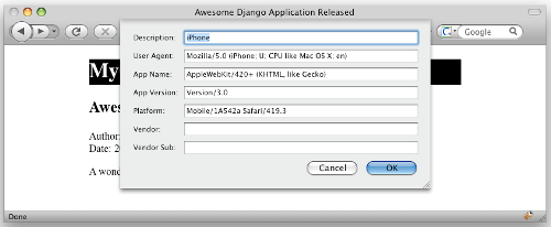
I installed the add-in in my Firefox application, and followed the directions provided to add a new user agent. I used these settings:
Description: iPhone
User Agent: Mozilla/5.0 (iPhone; U; CPU like Mac OS X; en)
AppleWebKit/420+ (KHTML, like Gecko)
Version/3.0
Mobile/1A542a Safari/419.3
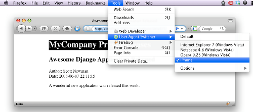
With these settings in place, I went up to Firefox's Tools menu, chose User Agent Switcher, and chose the new iPhone setting. With this setting, my browser tricks web servers into thinking it's an iPhone.
Browse to the URL http://localhost:8000/, and the middleware should immediately try to redirect you to http://localhost:8001/.
Summary
In this article, we've explored the topic of serving content with multiple templates. We looked at the different approaches available to serve content to mobile devices, including using basic templates and content adaptation.
We learned how to detect the presence of a URL parameter to dynamically choose the template loaded in a view, and how to use the TEMPLATE_DIRS setting to override a template on demand without having to change any code.
Finally, we leaned how to serve a second set of templates to a separate domain name by creating a settings file to override the default settings. We also explored a technique using middleware to redirect users to a different URL based on their browser's user agent string.